-
 Registered Channel Partners
-
 Partner With Us
-

-


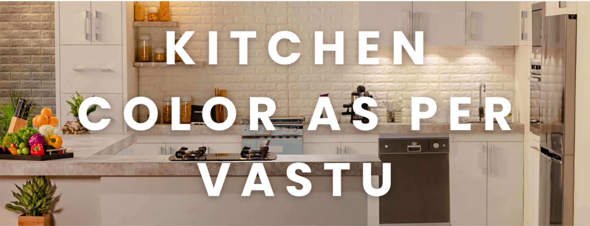
Color for Kitchen as per Vastu: Best Wall, Cabinet and Platform Colours According to Vastu Shastra
Table Of Contents
In Vastu Shastra, the kitchen is treated as an energy centre of the home, governed by the Fire element. This makes colour selection more than a decorative decision. The right color for the kitchen as per vastu can influence how balanced, active and harmonious the space feels on a daily basis.
Traditionally, warm hues such as saffron, soft orange and muted red are preferred, as they align with the Fire element. For a balanced appearance, lighter tones like cream, beige and gentle yellow are recommended for walls. Dark colours such as black or deep navy are usually avoided, as they are considered to conflict with the energetic nature of the kitchen.
Why Choose Colour for a Kitchen as per Vastu Shastra?
In Vastu Shastra, the kitchen symbolises nourishment, health and prosperity. It is governed by the Fire element, which represents transformation and energy. The best color for the kitchen as per vastu therefore aligns with warmth, brightness and balance.
Soft orange, muted red, peach and saffron are often recommended because they enhance vitality without overwhelming the space. However, this does not mean the kitchen must be painted entirely in bold tones. In modern homes, these colours are usually incorporated through accents, backsplashes, cabinets or décor, while neutral bases maintain visual comfort.
When choosing a kitchen colour as per vastu shastra, balance is key. The space should feel energetic yet not aggressive. Excessively bright red, for instance, may cause restlessness, while overly pale shades may dull the intended fire energy.
Do you know? You can also check vastu colours for different rooms to align your home design as per vastu shastra.
Directional Vastu: Choosing Kitchen Colours by Location
The placement of the kitchen within the home influences suitable colour selection. Vastu divides the house into directional zones, each governed by an element.
South-East (The Agni Corner): Fiery Tones for Energy
The South-East is considered the ideal location for a kitchen. If your kitchen lies here, warm shades such as saffron, coral, light orange and brick red complement the Fire element naturally. These tones reinforce vitality and support household harmony.
In such kitchens, the kitchen wall colour as per vastu may include cream with warm undertones or light terracotta to prevent the space from feeling overpowering.
North-West (The Vayu Corner): Neutral Whites and Silvers
A kitchen in the North-West is governed by the Air element. Here, neutral whites, off-whites, pale greys and metallic accents work well. These colours maintain balance without intensifying the Fire element excessively.
Subtle silver or champagne finishes in cabinetry can also harmonise this zone while keeping the overall kitchen color vastu shastra aligned.
East (The Sun Corner): Earthy Greens and Browns
An eastern kitchen benefits from earthy shades such as olive green, pistachio or light wood browns. These colours reflect natural light beautifully and create a calm yet energised atmosphere.
When selecting the best color for kitchen walls as per vastu in this direction, lighter green tones paired with beige flooring can produce a balanced effect.
North (The Kubera Corner): Wealth-Inducing Light Blues
While blue is generally avoided in excess, very light blue in a North-facing kitchen can symbolise water and financial flow. It should be used carefully and combined with warm neutrals to prevent elemental conflict.
In this case, the colour for the kitchen according to vastu should maintain warmth through cabinetry or décor accents.
2026 Modern Modular Trends Aligned with Vastu
Design preferences are evolving, but vastu compatibility remains relevant even in modular kitchens.
The Rise of Sage Green: Balancing Fire and Growth
Sage green has gained popularity for its calming quality. When paired with wooden textures, it supports balance between Fire and Earth elements. It works particularly well as a secondary shade in a vastu-compliant design.
Warm Terracotta: An Earthy Alternative for Agni Zones
Terracotta offers warmth without the intensity of bright red. It complements South-East kitchens beautifully and aligns with the best colour for the kitchen according to vastu principles.
Two-Tone Combinations: Wood Finishes with Neutral Creams
Modern modular kitchens often combine wood laminates with cream or ivory finishes. These kitchen colour ideas as per vastu maintain positivity while offering contemporary elegance.
Kitchen Layout Components: Vastu-Compliant Materials & Shades
Kitchen Platform (Slab) Colours as per Vastu
The kitchen platform color as per vastu is ideally light, beige granite, light brown quartz or muted cream marble are preferred. Dark black slabs are typically discouraged, especially in South-East kitchens, as they symbolically suppress the Fire element.
Cabinet and Trolley Sunmica Shades for Positive Energy
When selecting kitchen cabinet colors as per vastu, consider light wood, cream, peach or soft yellow finishes. Glossy red may be used sparingly for accent cabinets but should not dominate the space.
Best Floor Tiles and Backsplash Combinations
For flooring, neutral beige, light brown or subtle patterned tiles are recommended. The kitchen tiles color as per vastu should feel grounded and warm rather than cold or overly dark.
Backsplashes can incorporate mosaic patterns in cream, gold or muted orange tones to enhance vibrancy without overwhelming the room.
| Before planning the Vastu colours for your kitchen and home, it’s also worth exploring ways to enhance your overall lifestyle. Discover some of the finest residences in your city by L&T Realty, designed to elevate your living experience. |
Vastu “Don’ts”: Colours to Avoid in the Kitchen
| Colour | Reason to Avoid |
| Black | Symbolically suppresses the Fire element and may create heaviness |
| Dark Grey | Associated with dullness and stagnation |
| Navy Blue | Represents water, which conflicts with Fire energy |
| Deep Purple | Considered too intense for food preparation zones |
The Impact of Black and Dark Grey on Household Harmony
Dark tones absorb light and reduce warmth. In vastu philosophy, they are believed to hinder positive energy circulation in the kitchen.
Why Dark Blue Clashes with the Fire Element
Blue symbolises water, which directly opposes Fire. Excessive blue in a kitchen may symbolically weaken vitality and enthusiasm.
Vastu Tips for Health and Wealth in 2026
- Keep the cooking stove in the South-East zone wherever possible.
- Ensure adequate natural light and ventilation.
- Maintain cleanliness and avoid clutter.
- Introduce indoor herbs for freshness and balance.
- Follow simple vastu tips kitchen colour as per vastu by blending warm tones with light neutrals rather than extreme shades.
The ideal kitchen colour according to vastu shastra should support both aesthetic appeal and energetic harmony. A well-balanced kitchen contributes not only to comfort but also to household well-being.
FAQs
Which color is lucky for the kitchen?
Warm shades such as saffron, light orange and peach are considered the best for the kitchen.
Which color is good for the kitchen as per Vastu?
Cream, beige and soft yellow combined with warm accents are widely recommended.
What colors should not be used in a kitchen?
Black, dark grey and deep blue are generally avoided.
How do I fix Vastu Dosh in a North-East kitchen using colour?
Introduce warm tones such as peach or cream and reduce the dominance of blue or grey elements to rebalance energy.
References:
Mayamata & Manasara
Ancient Indian architectural treatises that provide traditional explanations of space elements, directions and energy influences in residential planning, often referenced in Vastu Shastra literature.
Brihat Samhita (Varahamihira)
A classical text on architecture and planning that informs many later Vastu interpretations.
Journal of Environmental Psychology
Studies on the influence of colours on mood, comfort and perceived energy. Research shows warm tones (yellows, oranges) tend to be stimulating, while dark, cool colours (blues, black) may have calming or heavy effects in interior spaces.
Reference: Impact of colour on mood and behaviour in built environments, Journal of Environmental Psychology.